ChalkUp Project
Overview
Branding
ChalkUp is a multi-day bouldering event with competitions, vendors, and outdoor activities. When I began climbing, I immediately noticed how collaborative the culture is. Climbers cheer for strangers and celebrate progress. I wanted my branding system to mirror that spirit: energetic, friendly, and approachable.

SHOWCASE
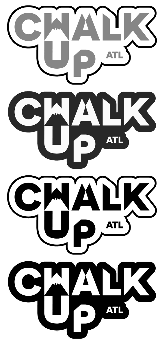

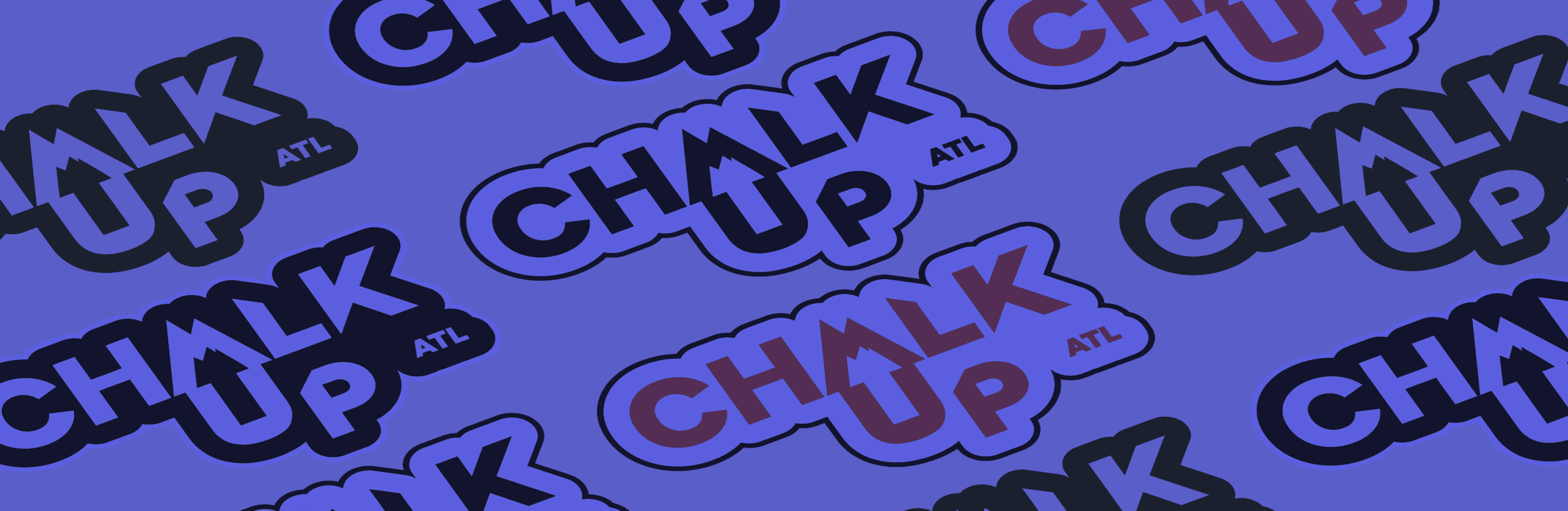
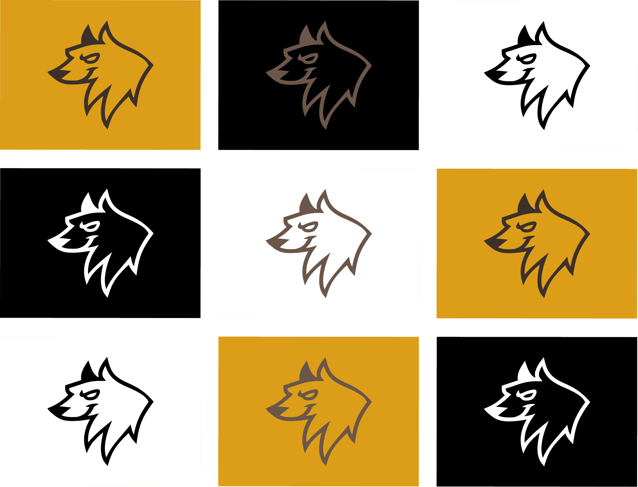
Logo
first came the logo design. It went through multiple explorations. I focused on bold typography, sharp angles, and combined the shapes of an arrow and a mountain. I also kept the type geometric and thick so it could scale across merch, signage, and digital platforms with strong visibility. The arrow reinforces the idea of an upward movement or “sending” a route in the climbing sport.
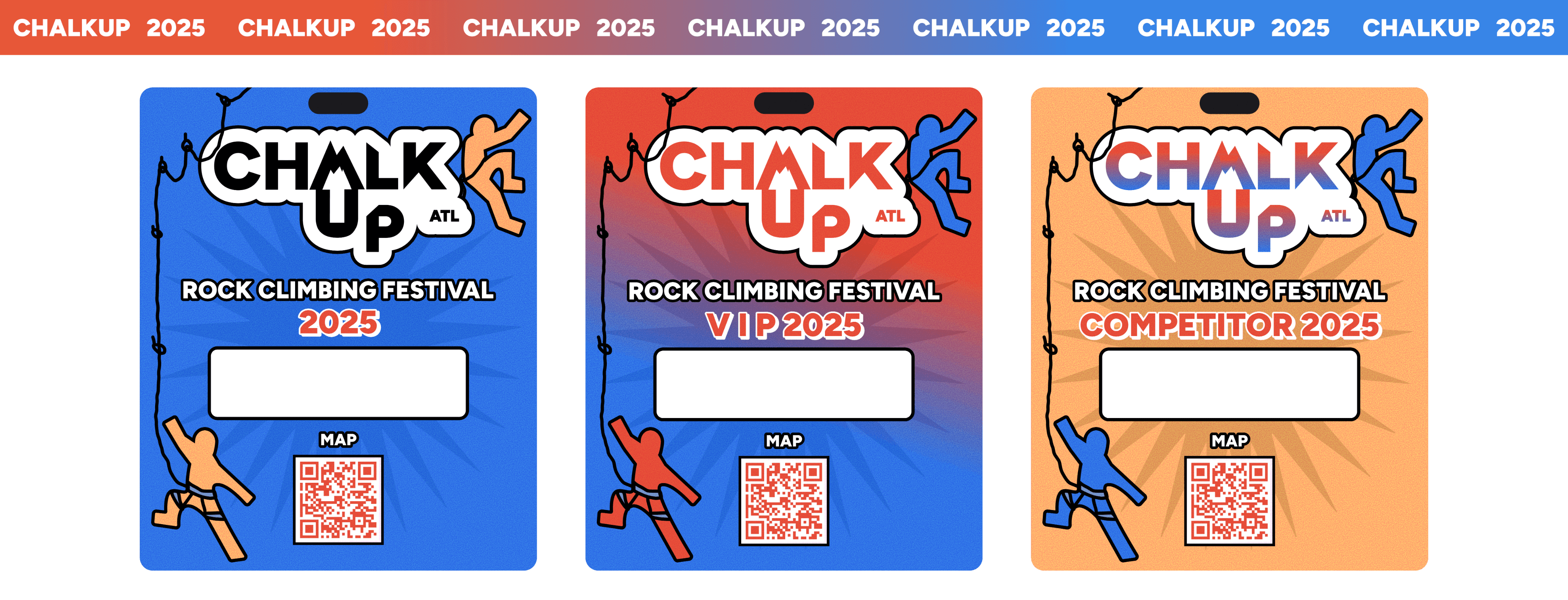
Passes
Next, I moved into branded materials like competitor and VIP passes and a lanyard. My goal here was to build a system that felt fun and event-driven but still cohesive.
I used bright colors and rugged outlines to make each different pass distinguishable from the next. At the same time, the illustrated climbers add human connection and movement. These would help attendees identify their level at a glance.
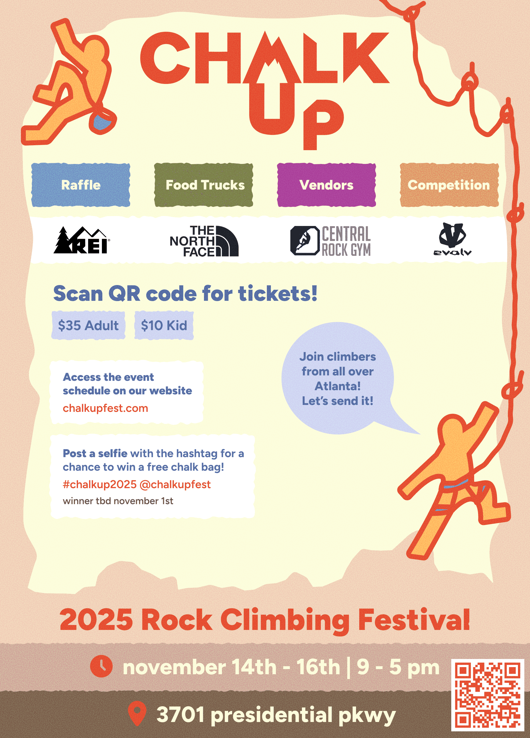
Posters
For the posters, I combined practical information with playful storytelling. They include sponsor logos, event dates, prices, QR access, and a full festival schedule. I designed them to function both as marketing — something that could be posted online, in a gym, or outdoors. Large rounded shapes and colors give everything an inviting tone, reflecting the supportive environment climbers value.

More projects

Get In Touch
It would be a joy to design with you!
I share updates with my progress and discoveries
arwright0128@gmail.com
Phone
(770)519-3253
I post my personal life
Behance
Not yet...
Working on creating it now!